QUESTION 7: HOW DID YOU USE MEDIA TECHNOLOGIES IN THE CONSTRUCTION AND RESEARCH, PLANNING AND EVALUATION STAGES?
I will start from the beginning of my project, and analyse how media technologies have helped in the construction of my work. I began working on all of my research, which was put together onto my blog. I used the blogging website: WordPress (the website/blog you are on now). WordPress allowed me to put all of my information and work in one place, allowing me to categorize the pieces, as well as allowing me to go back and edit it any time I wanted to. It works almost as a diary of everything I have learnt leading up to the final production. I will be going into each stage of my project and what media technologies have been used.
Research
I then began the initial research into music magazines to give myself an insight into the background. Without the use of the Internet this would not have been possible. I began with the history of music magazines and a basic music industry essay.
I used Wikipedia, Google and books on the music industry to find the information that I used throughout the first few initial stages. Wikipedia provides a basic overview of what I was looking into to, but cannot be entirely reliable as it can be changed anonymously and cannot truly trust everything on there. I would then use Google to find external sources of information on the topic I have searched for on the posts on the blog I have mentioned where I found my research. I would then be able to cross-reference the information on Wikipedia, to justify whether the info was in fact correct. Another website I used frequently was: Slideshare. This again could be reliable but it was put into basic understandable terms.
The second media institute I used was existing music magazines that are available on the shelves now; this allowed me to categorize the genres and begin my understand as to what goes into each genre that makes it successful
I used the survey website – www.surveymonkey.com to conduct research on the viewing habits of music magazines (as well as paper copies) I Did thus so I could gain an insight into what they would expect as well as asking what they would recommend what they would like to see. I used Microsoft Word and Microsoft Excel to gather my results together and put them into graphs and charts so my information was easier to process. Without doing this – I would not have found out what people would expect to see and what they would like – it was extremely beneficial when it came to the production of my own work.
Pre-Production
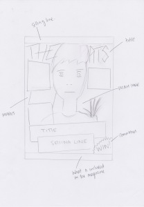
As I had conducted all of my research in the research phase of my project, I began working on pre-production. This began with drafting out ideas as by hand. I did plans on what each page would look like as well as drafting out titles. I then scanned the images back onto my computer. I did this simply with my home printer, I placed the paper under the tray at the top of the printer and chose the scan onto computer option. I then drew out shot listings and storyboarding – this was also scanned onto the computer using the same method.
I also predominantly used the software Microsoft Word. I used this to write my own feature as well. The software was a lot easier to use than doing it by hand, as it implemented spell check in areas I had made minor spelling mistakes, and it was a lot quicker. I again used Microsoft word to conduct a shooting plan, and to update it as I filmed each segment. This helped me stay on track, and to cover everything I needed to fit into the magazine. I would use my printer on the day of shooting and print out the shooting plan for that section and take it with me to the shoot, I would use it and then act in the moment and take shots I thought I could add in or things that could work.
Production
The camera I used for the majority of my work throughout this course was this Canon camera shown below. This was apart from a few occasions when I used my iPhone when I did not have this camera available. On one occasion the application: Snapchat was used for an image that is displayed on my contents page.
Post-Production
The computer I used for the majority of my work throughout this course was my iMac that I have at home. This was apart from a few occasions when I did my work on another iMac at school or using Photoshop – the software I sued to edit all of my original images – on the Windows computers at school.
I used the software Microsoft Publisher to make my magazine pages, this was much better than using Microsoft Word – which I had previously done – as it allowed me to manipulate and move images a lot easier than Microsoft Word has allowed to do so.
I used the survey website – www.surveymonkey.com again to conduct research on what people thought of my magazine. I also used paper copies and handed them out to colleagues/friends/family. I felt this had a negative influence as almost every copy I received back had been crumpled up, had drawings on and were not answered sufficiently providing me with useless feedback.
When it came to this analysis I again used Microsoft Word to type it out.
QUESTION 6: WHAT HAVE YOU LEARNED FROM YOUR AUDIENCE FEEDBACK?
The age range of my magazine is a wide range, it can start from pre-teens to teenagers of when their keen taste in music begins, to the older audience, who are the parents and grew up listening to the music. It can also work in a way that parents can read it, as they are interested in what their children are reading.
As I had now finished my practical production – and as mentioned in my earlier post – I had created a secondary questionnaire on:
www.surveymonkey.com, I then handed out packs of my final production so they could view my work and then fill out the questionnaire. I asked students, colleagues, friends, work friends, family, and teachers to fill this out for me.
Questionnaire Responses.
In my post before I explained that I had created a questionnaire on the website: Surveymonkey.com. I decided to reuse this medium as I found it effective during the first run of feedback when I was in the preliminary stages of my projects. The aim for this run of result findings was to get an overview on what people made of my magazine and their own personal views on it. The results I received were over a period, and the responses I received were from teachers, friends, work colleagues, fellow students as well as family. I managed to receive 30 responses and below I will be analyzing my findings.
Using the online website “Survey Monkey” had its positives and its negatives. The positive were that I was able to distribute my questionnaire to a wider range of people, and is quick and easy to make and to fill out. The negatives being that you could answer one questionnaire on each device. For example if I had the questionnaire up on a computer and filled it out, I would now not be able to fill it in again. I found this to be a negative as I could have been able to have the questionnaire open on one device and got as many people – in my class or friends – as I could to come to this computer to fill it out.
I also handed out paper copies of the same questionnaire which was entirely negative as almost every copy I received back had been crumpled up, had drawings on and were not answered sufficiently providing me with useless feedback.
All the images displayed in the post can be enlarged – simply by clicking on the image itself.
Question 1:
What is your gender?
This is an important question that every questionnaire begins with. It allows the author to put their findings into a criteria depending on the genres. The amount of replies I received was fairly even and it allows me to view how each gender viewed my magazine.
Female: 13
Male: 15
28 Responses
2 Invalid responses
Question 2:
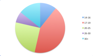
Which group does your age range fall into?
This question – similar to Q1 – is always at the beginning of a questionnaire it is needed to judge who you are getting these responses from. As I received responses from a range of people my results are completely varied but the majority being the ’17-19′ category.
14-16: 3
17-19: 12
20-25: 7
26-30: 2
30+: 4
28 Responses
2 Invalid responses
Question 3:
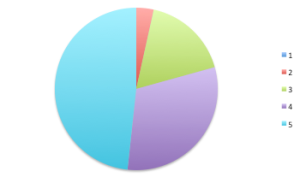
What rating would you give my work from a scale of 1-5, 1 being bad, and 5 being good?
I decided to ask this question to get an average rating of my video, I originally planned to do the question from 1-10, but decided this was too large a range and would have been harder to narrow it down into a number, so I stuck to 1-5. The results I received were a mixture, as I received votes for all categories from 2-5. One person thought it was a 2 out of 5, I like this type of criticism as it is honest and gives us a true insight and gives a real view of how the magazine was received, there were 5 votes for 3, this was then the real numbers began to grow when it hit 4 and 5. This is where a lot of my results fell; this is very humbling, as I believe it still has the honesty and truthful factor. The most votes however was 5 at 13 people, I believe if this had been taken by people who did not know me, my results would be marginally different, as they can be biased.
1: 0
2: 1
3: 5
4: 9
5: 13
28 Responses
2 Invalid responses
Question 4:
Was there anything you specifically liked about it?
I wanted to ask this question and give it a basic yes and no answer to make the answering simple but then allow the person answering the question a comment box in case they wanted to explain why. Unfortunately I only received 11 comments from the 28 who took the questionnaire. The comments I did receive were of an array of answers, which is a very positive piece of feedback about my production. I feel this question isn’t given the suitable closure however that the people who answered no, may have really liked the work but answered no as there wasn’t anything that they specifically enjoyed.
Yes: 20
No: 8
If so, what was it that you liked?
- Pictures
- Design
- All
- Pictures/Design
- Structure
- The book idea
- Pictures
- Layout
- The design
- Eye catching and looks like it’s a real magazine
- The images
28 Responses
2 Invalid responses
Question 5:
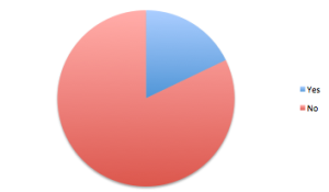
Was there anything you did not like?
This links in with the previous question but allowed room for a critical feedback. I opened it up once again with a yes and no option and a comment box for them to explain what they did not like. Unfortunately again only 3 people commented out of 28, which didn’t give me the intended results. No there was not anything they disliked was the winner by a long, which is very positive, as many people didn’t find bits they did not like.
Yes: 5
No: 23
If so, what was it that you disliked?
- Layout
- Fonts
- The story of the double page
28 Responses
2 Invalid responses
Question 6:
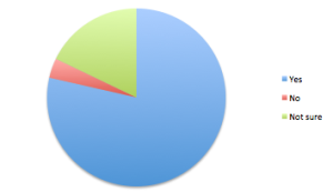
Did you think my magazine fit my genre stylistically?
I wanted to see if my production had been produced in a way that was professional, and could easily be identified as a rock magazine. The answer options I gave were “Yes”, “No” and “Not Sure”. Out of my 28 responses, 22 people answered yes as they perceived it through connotation in some cases and denotation in others to be a “Rock” magazine. The 5 people who answered “Not sure” back this up.
Yes: 22
No: 1
Not sure: 5
28 Responses
2 Invalid responses
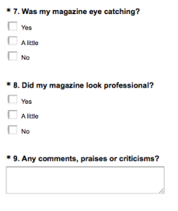
Question 7:
Was my magazine eye catching?
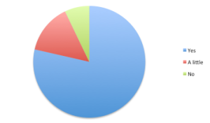
This question works in conjunction with the previous question I asked. I wanted to see if my production had been produced in a way that was professional, and could easily be identified. The answer options I gave were “Yes”, “A little” and “No”. Out of my 28 responses, 25 people answered yes which was a very desirable outcome. It showed a very positive view of my magazine.
Yes: 25
A little: 2
No: 1
28 Responses
2 Invalid responses
Question 8:
Did my magazine look professional?
I wanted to ask this question so as to see how professional it was, and whether it would look out of place if it were played on a magazine stand. The options I gave the recipients were: “Yes”, “A little bit” and “Not at all”. I received responses for each option. The winner however with 22 answers was yes.
Yes: 22
A little: 4
No: 2
28 Responses
2 Invalid responses
Question 9:
Any comments, praises or criticisms?
I decide to add this question in even though the question had been asked already, was because like my results have shown not everyone would supply me an answer in the comment box, so including this question is almost tricking them into giving me a response. I simply supplied an essay box that they were able to fill out. Obviously I received some stupid answers, but there were some interesting comments, which gave me answers to previous questions.
- Good!
- Rad!
- Very good
- Looks professional
- Well designed and looks professional
- Cool man
- Make more pages
- Nope
- ??
- Very good work
- coooool
- Good attempt
- Id like to see another
- It looked like it could be sold in a shop
- Sucks
- yeh bruv
- Well done mate
- Very creative.
9 Responses
Taking all of the invalid responses out of this, I have learnt that I gained a lot of positives from the feedback, and far more positive than negative, although the negative critiques is what I am looking for.
QUESTION 5: HOW DID YOU ATTRACT/ADDRESS YOUR AUDIENCE?
I will start at the front of the magazine and work my way through it.
The front cover is the first page that the audience sees, so it has to draw the viewers in, it is the page that has to be sold to the reader, and so it must have an attraction.
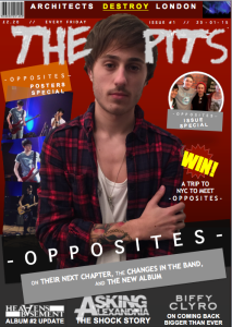
I believe I have fulfilled this by using an image that looks iconic, and which creates a ‘star persona’ about the protagonist – this image also represents how I have directed it towards my target audience. The masthead is unique and is superimposed below the main images head – implying that you do not need to see the whole title to recognize who has made this magazine.
The title below the main image tells the audience who the main feature is based on. I used rectangular backgrounds behind this and changed the order of them – placing the main image in between – this gives the page dimension and shape. It brings it into the viewer’s eye line following the design balance in which I researched at the beginning of this project.
Using big bands names on the front cover of the magazine act as selling points as well. The colour scheme is an important aspect to talk about as well. The background of the page is a blood red that has connotations of love/danger/passion. These are also connotations of the genre of Rock as well, the connection of these two were intended.
The contents page links in with the big bands that are featured in the magazine, these act as selling points, an example being: Slipknot. Slipknots fan base are called: Maggots. These are diehard fans that follow the band in anything and everything they do. This alone means that the ‘Maggots’ will immediately be interested in reading my magazine as their favourite band is featured.
I have included an advert to win a trip to New York City to visit the band ‘Opposites’ who are recording their new album there. The reason I did this was because when I gathered the results of my research into magazines questionnaires I found that a lot of people liked competitions in magazines, means I was catering for their demands.
On my double page spread the feature involves the growth of a band and the bad luck and changes that they have encountered on their way, this also ironically is not big news, as every band has struggled to make it, and have had their rough times on the rise to fame; I still decided to write about this topic as it is interesting. Viewers don’t like reading happy stories all the time, they like a gritty unlucky story that has its bumps in the road. I wanted to write about something that would interest readers. Once they have delved into the pages, to actually keep them there with an interesting feature page.
Through the production of my magazine I have used commodification (where the artist/music becomes a product and needs to be sold) and synergy.
As my magazine has a title that would be identified as a logo, I felt I would do further research into this so my magazine can appear to be more professional to the consumer or audience. In my research into logo’s I found that a good logo has to have these aspects:
– Simple
– Memorable
– Timeless
– Versatile
– Appropriate
Simple:
If the design for the logo is simple it allows the consumer to recognize it, which ultimately covers the second point as it becomes memorable.
While in college in the mid-70’s an instructor introduced me to the K.I.S.S. Principle of design; which translates to: Keep It Simple, Stupid. It does convey a very important design consideration. Simple logos are often easily recognized, incredibly memorable and the most effective in conveying the requirements of the client. A refined and distilled identity will also catch the attention of a viewer zipping by signage at 70 miles per hour, on packaging on the crowded shelves of a store, or in any other vehicle used for advertising, marketing and promotion. Remember, the basis of the hugely effective international branding for the world’s largest shoe manufacturer is a very simple graphic swoosh. – Jeff Fisher
(Quote found from: http://justcreative.com/2009/07/27/what-makes-a-good-logo/)
Memorable:
This works very closely with being simple. If it is simple, it is recognizable; if it is recognizable; it is memorable.
An example of this would be the ‘McDonalds’ logo – which has always been of the golden, high arched ‘M’. Anywhere in the world you see this specific type of ‘M’ you will know what brand it is.
Timeless:
For a logo to be effective it needs to be timeless, and to make it appeal the same now as it could in 20+ years.
The best example of a timeless logo would be the ‘Coca-Cola’ design in comparison to one of its main competitors: ‘Pepsi’ which is shown on this table below.
(Research found from: http://justcreative.com/2009/07/27/what-makes-a-good-logo/)
Versatile:
For the logo to be versatile it should be designed in the vector format, meaning that it can be resized and rescaled to any size and be able to work horizontally and vertically.
Appropriate:
It should appeal to its target audience, if the logo is designed for a toy company, the font should be bright and bold, in comparison if you were creating a logo for a car logo, it would need to slick and sharp. You have to make it work in the circumstance in which you are working.
I believe that my product actually fits 4/5 of these aspects, the problem with it is the versatility as it is on a landscape placement and wouldn’t be able to moved and around and changed positioning effectively. I think it looks is simple yet eye catching, and also memorable.
QUESTION 4: WHO WOULD BE THE AUDIENCE FOR YOUR MEDIA PRODUCT?
My audience for my magazine is a very specific one. In today’s music market it is full of pop and processed music. The genre of rock is dying out (which I have shown in my research into my chosen music scene). The audience range is then isolated, and you have to be a fan of rock to be interested in my magazine. Although the genres of pop and rap are becoming ever more popular, I believe that rock music still has a firm following. From the parents who grew up listening to bands such as ‘The Beatles’, ‘Led Zeppelin’ and ‘Pink Floyd’ who then pass on their taste to their children and so on.
In various interviews in rock magazines that I have read have shown interviews with ‘rock stars’ that say that their music taste was passed down to them by their parents, and when they finally find a band that is new to them, the music taste really begins to excel. One of my sub genres for the magazine is metal, and from experience metal fans are also narrow minded and are ignorant to other types of music.
I have decided that I would use all of the main genres associated around rock and then all of the subgenres. This is too satisfy everyone’s need, and ultimately allowing the audience to expand. The age range of my magazine is a wide range, it can start from pre-teens to teenagers of when their keen taste in music begins, to the older audience, who are the parents and grew up listening to the music. It can also work in a way that parents can read it, as they are interested in what their children are reading.
QUESTION 3: WHAT KIND OF MEDIA INSTITUTION MIGHT DISTRIBUTE YOUR MEDIA PRODUCT AND WHY?
My magazine would be available in many retail outlets such as WH Smiths, who sell a range of magazine, to corner shops and super markets. I would also run a subscription service allowing the audience to pay a monthly installment to get it sent to them directly. My magazine would be available online as an online subscription as well. Due to the growth of tablets and smart phones, I would also release a tablet/smart phone application that would allow. I would like to make the availability of my magazine to be vast, allowing the audience to read a hard copy of the magazine, to reading the magazine at will on their phone. I wouldn’t want to stick to the original hard copy of the magazine, as that would be sufficient enough for the magazine to survive.
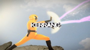
As in many other aspects it would be synergistic and be able to link to a music channel for example; ‘Kerrang!’ have their own music channel and magazine and are formed by a link, the same scenario occurs with magazines such as ‘Q’. This is a key link that would be allowing me to sell my magazine to my target audience through advertisement on the music channel. The website would have to be updated regularly as well, providing the latest news, new music and podcasts.
QUESTION 2: HOW DOES YOUR MEDIA PRODUCT REPRESENT PARTICULAR SOCIAL GROUPS?
My chosen social group from my proposal was people are interested in the music genres of Rock/Metal/Punk. I have not specifically catered for all of these people in my final page. This is simply down to the fact that I have stuck mainly to the rock genre – meaning I was not able to satisfy all of the genres with the bands that I have featured and hinted towards.
The protagonist on the front cover is wearing a vest with a long necklace; his arms are tattooed and he has a messy look about him. The colours I chose were of particular importance. I believe they act as a contradiction, as the white vest is connotated as being pure, innocent and saintly – which is not representation of the rock genre – whereas the red shirt has connotations of love, danger, anger and passion – which do represent my genre. I wanted to this to add dimension to the character. These aspects of the image represent the look of a ‘rock star’ ultimately representing my particular social group. In a way this is challenged by the hair of the protagonist being shorter where a stereotype of a ‘rock star’ of having long hair. The pose at which I am standing in the main image of my front cover is significant of Oli Sykes (whom I intended to base it upon – this image can be found in my previous drafting post). Oli Sykes is a person at the forefront of the current day rock music scene. The other bands around the page are diverse and each band/artist has their own fan base/following.
The image on the double page spread is similar to the one on the front cover in that the protagonist is wearing a vest with a long necklace; his arms are tattooed and he has a messy look about him. I believe the images that I have used represented my chosen group, as a diverse, unique and exciting group of people. These groups of people are not always seen as normal people and are often stereotyped as weird. I like to play on the idea of weird, as it is an interesting notion. If people think that it looks weird, or the people look weird, then that is controversial, and if they find it controversial, then they are interested and that interest it ultimately shown towards the magazine. I would like to represent the group of people are being creative, unique and dedicated force.
QUESTION 1: IN WHAT WAYS DOES YOUR MEDIA PRODUCT USE, DEVELOP OR CHALLENGE FORMS AND CONVENTIONS OF REAL MEDIA PRODUCTS?
Throughout this project I have designed and produced: a front cover, a contents page and a double page spread. I will go through each of these three parts and analyse whether it challenges or develops the forms and convention of real media products.
I will start from the front of the magazine with the front cover.
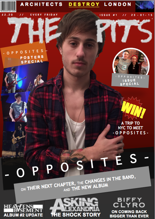
The title for my magazine is called: The Pits. The reason as to why I chose this name is because it links to the movement of a ‘mosh pit’. ‘Moshing’ is a connotation of my genre of music. I decided it would be written in a rough distorted typography that supports the convention of rock being rough and on the edge. I decided that I would use it in a white font, as it was set upon a blood red background. I did this to give it another dimension and to make it in your face. By my magazine having a direct masthead this follow the convention of real media products.
My magazine follows the basic convention of having a main image, as well as having smaller images around the page. The protagonist of my main image on the front cover is wearing a vest with a long necklace; his arms are tattooed and he has a messy look about him. These represent the look of a ‘rock star’ ultimately representing my particular social group. In a way this is challenged by the hair of the protagonist being shorter where a stereotype of a ‘rock star’ of having long hair. The pose at which I am standing in the main image of my front cover is significant of Oli Sykes (whom I intended to base it upon – this image can be found in my previous drafting post). Oli Sykes is a person at the forefront of the current day rock music scene.
The headline for my page reads: “Opposites: on their next chapter, the changes in the band and the new album” it is written in a white bold typography. The ‘Opposites’ part is on a black background where the selling line is on a grey background. This follows the convention as it adds to the main image and explains what is inside. This part is very important as it the main article so it needs to entice as many readers as possible.
Below the headline there is a bottom bar that has three bands logos (Asking Alexandria, Biffy Clyro and Heavens Basement). Each logo is in a white typography and has a caption underneath explaining what the topic of their article is about. I decided to do this to open up to other genres and to interest other readers. This is also evident at the top of the page above the masthead. It reads: “BMTH destroy Wembley” the word is ‘destroy’ is written in a yellow typography and is underlined; this makes it the key buzzword in the sentence. There are other selling points around the page for example the circular feature to the right of the main image, as well as the competition below that. All of these features follow the convention; their main purpose is to get the reader to open this page.
On one side of the main image there is a poster section. The three images that are used as the posters are original images taken by or of myself. In a way this challenges the convention of posters, as they are live shots, whereas they are usually studio shots.
The last thing to talk about which is a convention which is crucial is that there is a barcode. This is essential so the magazine can actually be sold.
The second page is then the contents page.
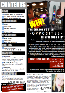
At the top of the page there is a masthead, this simply reads: “Contents”. This is to headline the page so the reader knows which page they are looking at. It is written in a white typography that is set upon a black rectangular background. This follows the convention of a real media text.
Below this is the most important part of a contents page is the actual listing. The list is categorized into sections (News, on the road, new albums, posters, features and advice from) these headings are in bold grey letters with a black rectangular box as a background. The reason why they have the black background is to make them stand out as headers. Below the headers, there are then names of artists/bands or articles. These are written in capital letters and in a black bold font, some have a brief synopsis as to what the article is about which is in a regular black font and is in normal lettering below. Each line has a number next to it which identifies which page these articles are on, the numbers are in blue. This is so you can easily differentiate the page number. The use of colour here is very important as it gives the listing layers and directs your attention to certain areas.
Below these two images there is a segment that includes an image and a message from the editor of this magazine. The message includes what is included in that week’s edition, what he likes about it and what interested me as well as giving brief news of what will be in next weeks issue. The writing is small and in a black font set on the white page allowing it to stand out. The image shows that they are fun people and that they don’t take things too seriously. This is because it is not a straight close up, with a direct mode of address image. This isn’t a typical convention of a magazine but I decided to do it to give it a personal touch. I also decided I would place a ‘joke of the week’ for the same reasons. The genre of rock and metal are often stereotyped as being very serious, this then challenges this connotation as it has a playful element to it.
The last remaining part is the competition section. This is something I decided to put into the page as when I conducted and received all the results of my research questionnaire; I found that a lot of people liked the idea of winning something from the magazine. I could’ve decided to put in to win a material item such as a guitar or t-shirt but I thought that it would gain much more attention if it were to win a once in a lifetime prize. This is in a way challenges the traditional magazine competition as I aforementioned the prize is normally a material item.
The last section to go into detail upon is the double page spread.
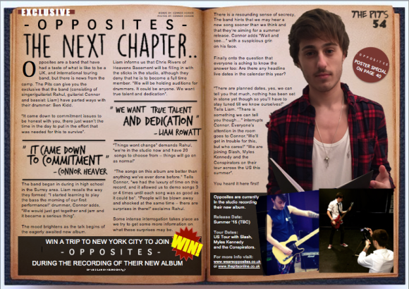
I will start at the top of the page with the masthead. The masthead reads: “Opposites: The next chapter…” It is on the left hand page only and it is in a calligraphic hand written typography, which follows a black colour theme. It is set upon a background of an aged yellowing book; this uses a play on word and has meaning behind the words. Above the masthead there is a small section that tells us who wrote the words and who took the pictures that I found is a convention as it gives the intended credit to who deserves it. There is also a buzzword that says “Exclusive” this entices the reader in to read the article.
My magazine follows the basic convention of having a main image. The protagonist of my main image is wearing a vest with a long necklace; his arms are tattooed and he has a messy look about him. These represent the look of a ‘rock star’ ultimately representing my particular social group. In a way this is challenged by the hair of the protagonist being shorter where a stereotype of a ‘rock star’ of having long hair. The pose at which I am standing in the main image of my front cover is significant of Oli Sykes (whom I intended to base it upon – this image can be found in my previous drafting post). Oli Sykes is a person at the forefront of the current day rock music scene. He is holding a book, which then adds to the reference of the background and the masthead. There are two images below this that are insights into the band.
The text of this article is in a small basic black font, which is placed in two paragraph columns below the masthead. There is one drop gap at the start which begin with the letters ‘O’, This is in a bold black so as to act as a contrast to the regular black font and to make it eye catching. There are also quotations which break up the text – this is done to make it easier to read and to follow the convention of drawing people in by giving them an insight into what they could read within. At the end of the feature there is a black rectangular box that has a white typography within which summaries the article by stating when they are on tour and where they can find more information as well as the web addresses. This follows the traditional forms and conventions.
There are two other sections, which I haven’t yet explained. Firstly on the first page at the bottom there is another reference to the competition that is advertised on the contents page and also a posters section that is advertised on the front cover. This is so the fans of this band/artist can go straight to the other pages that their favourite artist is featured ultimately drawing them in to read other parts of the magazine.
FEEDBACK QUESTIONNAIRE
As my production is now finished, I want to show people the final outcome and to see the overall feel of the final product.
This is a survey I put together on the website: http://www.surveymonkey.com, I decided to this so I could get a feel of how people I know and the overall audience viewed my magazine.
You are able to enlarge the images by clicking on them.
I also used this template, and copied into Microsoft Word. I then printed out around 25 copies and handed out as a pack including the final magazine to receive more responses.
You are able to open the word document of the questionnaire by clicking below.
